 Biplob Hossain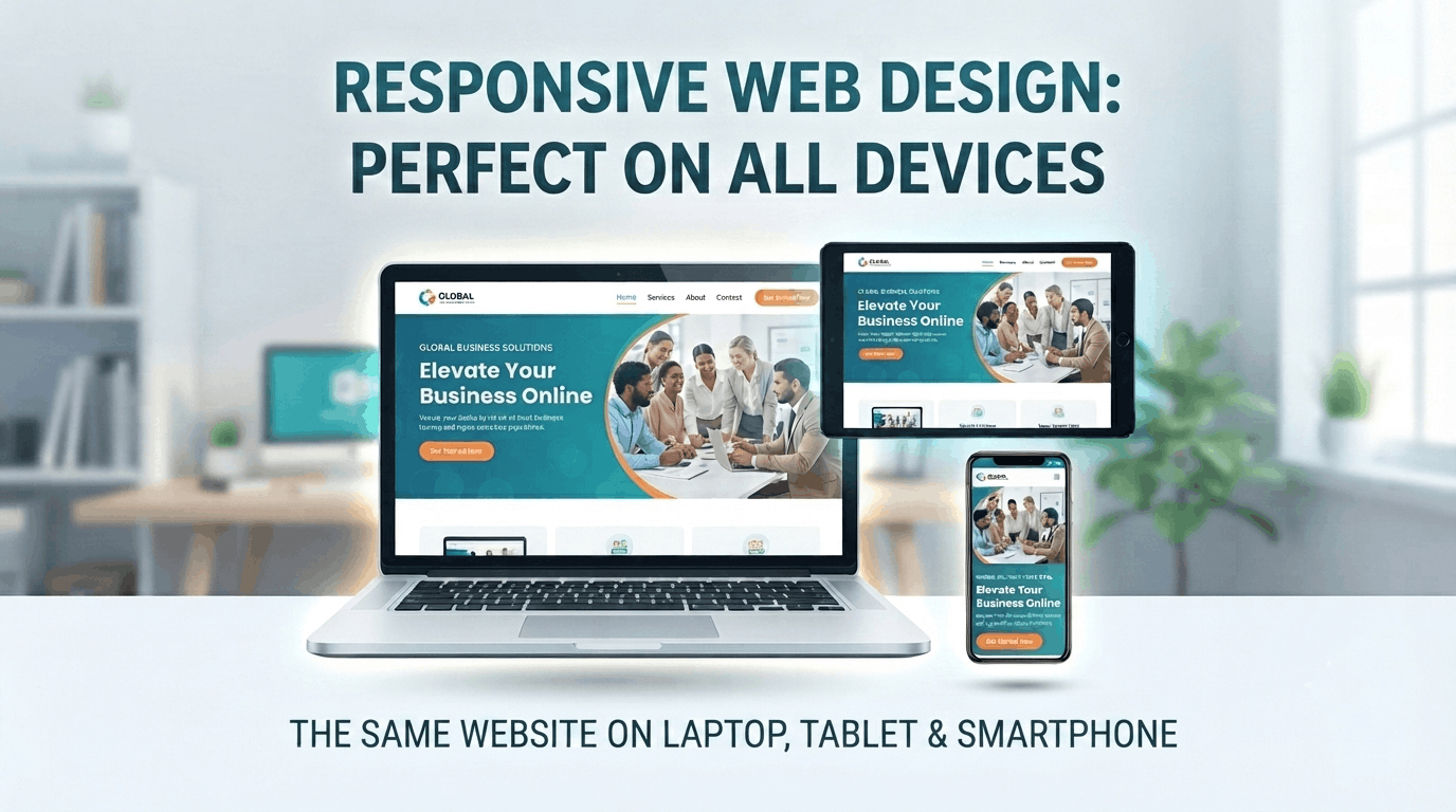
Why Responsive Web Design Matters for Every Website
Introduction
People use different devices to browse the internet every day. Some visitors use desktop computers, while others use laptops, tablets, or smartphones.
Because of this, a website should look good and work properly on different screen sizes.
This is where Responsive Web Design becomes important.
A responsive website automatically adjusts its layout, content, images, and other elements according to the visitor’s screen size.
In this article, we will discuss why responsive web design is important for every modern website.
1. Better User Experience
The main goal of responsive web design is to provide a better experience for every visitor.
Imagine visiting a website on your smartphone, but the text is too small, the buttons are difficult to click, and you have to scroll horizontally.
This can quickly frustrate visitors.
A responsive website makes sure that:
- Text is easy to read
- Buttons are easy to click
- Images fit the screen
- Content is properly organized
- Navigation is easy to use
A better user experience can help visitors stay longer on your website.
2. Mobile Users Are Increasing
Smartphones have become one of the most common ways people access the internet.
Many potential customers may visit a business website directly from their mobile phones.
If your website does not work properly on mobile devices, you could lose potential customers.
A responsive design ensures that your website provides a consistent experience across:
| Device | Responsive Design |
|---|---|
| Desktop | ✅ Optimized |
| Laptop | ✅ Optimized |
| Tablet | ✅ Optimized |
| Smartphone | ✅ Optimized |
This allows visitors to access your website comfortably, regardless of which device they use.
3. Improve Search Engine Visibility
Responsive design can also be beneficial for SEO.
Search engines want to provide users with websites that offer a good experience.
If your website is difficult to use on mobile devices, visitors may leave quickly.
A responsive website helps create a better experience for mobile visitors and makes it easier to maintain a single website structure.
Responsive design should be considered an important part of modern website development and SEO strategy.
4. One Website for All Devices
Without responsive design, you may need to create separate experiences for different devices.
This can make website management more complicated.
With responsive web design, you can maintain one website that adapts to different screen sizes.
For example:
Desktop → Tablet → Mobile
The website automatically adjusts its layout based on the available screen space.
This makes managing and updating the website easier.
5. Increase Customer Engagement
A website that is easy to use encourages visitors to explore more pages.
For example, a visitor might:
- Read your services
- View your portfolio
- Read your blog
- Submit a contact form
- Purchase a product
If your website is difficult to navigate on mobile devices, visitors may leave before completing these actions.
A responsive website can help create a smoother journey for your visitors.
6. Faster and Easier Website Management
Responsive design allows developers and website owners to manage a single website instead of maintaining separate desktop and mobile versions.
When you update your content, you only need to update it in one place.
This can save:
- Time
- Development effort
- Maintenance costs
It also helps keep your website content consistent across different devices.
7. Professional Brand Image
Your website is often one of the first places where potential customers interact with your business.
If your website looks professional on every device, it can create a stronger impression.
A responsive website shows that your business cares about:
- Design
- User experience
- Accessibility
- Professionalism
A good website should look professional whether someone visits it from a desktop or a smartphone.
📱 Responsive Design Example
Let’s imagine a business website.
Desktop View
The website may display:
Logo | Home | About | Services | Portfolio | Contact
The content can appear in multiple columns because there is more screen space.
Mobile View
The navigation may change to a mobile menu, and the content can stack vertically:
Logo | ☰
Then:
Hero Section
↓
About
↓
Services
↓
Portfolio
↓
Contact
This allows the same website to work comfortably on a smaller screen.
📊 Responsive vs Non-Responsive Website
| Feature | Responsive Website | Non-Responsive Website |
|---|---|---|
| Mobile Friendly | ✅ Yes | ❌ Often No |
| Tablet Support | ✅ Yes | ❌ Limited |
| Easy Navigation | ✅ Yes | ❌ Difficult |
| User Experience | ✅ Better | ❌ Poor |
| Maintenance | ✅ Easier | ❌ More Difficult |
| Professional Look | ✅ Yes | ❌ May Look Outdated |
🛠️ How to Make a Website Responsive
Developers can use different technologies and techniques to create responsive websites.
Some common methods include:
- CSS Media Queries
- CSS Flexbox
- CSS Grid
- Responsive Units
- Bootstrap
- Elementor Responsive Controls
For example, CSS media queries can be used to change a website’s layout based on the screen width.
When working with Elementor, you can also adjust individual elements for desktop, tablet, and mobile devices.
💡 Quick Responsive Design Checklist
Before publishing a website, check:
- Does the website look good on desktop?
- Does it work properly on tablets?
- Is the mobile menu working?
- Is the text easy to read?
- Are buttons easy to click?
- Do images fit properly?
- Is there any unwanted horizontal scrolling?
- Are forms easy to use on mobile?
Testing your website on multiple screen sizes can help you identify and fix responsive design issues before your visitors experience them.
🚀 Final Thoughts
Responsive web design is an essential part of modern website development.
A professional website should provide a smooth and consistent experience regardless of whether visitors use a desktop, tablet, or smartphone.
By focusing on responsive design, you can improve user experience, make your website easier to manage, and create a more professional online presence.
In today’s mobile-first world, responsive design is not just an option—it is a necessity.